After having conducted a series of consultations with Canadian consumers on ways to improve nutritional labelling on food labels, Health Canada undertook a broad review of the food labelling regulations. Several regulatory updates are proposed to enhance nutritional labelling, as well as the declaration of ingredients, allergens and bio-active compounds added to foods (e.g. caffeine).
This article describes the modifications proposed by Health Canada with respect to the declaration of ingredients and allergens. Proposed regulatory modifications related to the Nutrition Facts table and the declaration of bioactive compounds added to foods will be treated in separate articles.
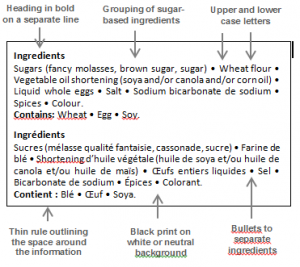
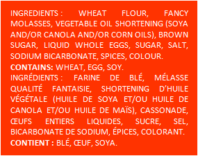
The proposed modifications to the display of the ingredient and allergen statements in comparison to an example of the current display are illustrated in figure 1.
Figure 1 – Display of the Ingredients and Allergen Declarations
|
A – Example of the Current Display |
B – Example of the Proposed Display |
|
|
|
 |
What do ACC Label’s nutritionists think about the proposed changes?
ACC Label’s nutritionists are in favor of the proposed modifications. However, they question the feasibility of some of the proposed graphic requirements, especially with label printers used in retail stores (scale printers), which cannot accommodate all of the proposed graphic enhancements.
The table below presents the various proposed features as well as the pros and cons as viewed by ACC Label’s team of expert advisors in food labelling.
Table 1 – Pros and cons of the various display features proposed for the ingredient and allergen declarations
Feature |
Advantages |
Inconveniences |
Opinion from ACC Label’s Expert Advisors |
|
Headings in |
Makes it easier to see where the ingredient list ends and where each allergen statement begins. |
In favor. |
|
|
Title |
Improves visual flow by decluttering the ingredient list. Creates a better separation between the French and the English. Easily applicable even with scale printers. |
The use of a separate line for both the French and English titles, reduces the available space for the ingredient and allergen declarations. This is a problem with long ingredient lists on small packaging. |
On small packaging, it should be allowed to print the headings on the same line as the ingredient lists, if the headings appear entirely in bold or uppercase letters. |
|
Black print on white or neutral background |
Helps locate the information on the label more easily. Ensures adequate colour contrast to facilitate reading. Consistent with the Nutrition Facts table. Easy to apply. |
Somewhat less aesthetic on some coloured labels, but this can be palliated by the use of light neutral colours, and by the fact that all labels will be alike, so it is not a competitive disadvantage. |
In favor. |
|
Outline rule to create a box |
Helps locate the information on the label more easily. Looks similar to the Nutrition Facts table. |
May be difficult to apply with some scale printers printers used in stores for in-house labelling (e.g. meal items prepared in stores and labelled with scale printers). |
There should be an exemption for retail establishments who produce their labels with scale printers. On such labels, the ingredient and allergen information could be separated from other label elements with a line of asterisks or some other feature that can be easily produced with a scale printer. |
|
Specifications for maximum |
May facilitate reading (very long lines slows down the reading). |
Regulations should take account of the diversity of packaging formats. |
|
|
Bullets |
Separates main ingredients better than a simple comma. Visually appealing. |
Not user-friendly for the individuals that type the ingredient lists, since the bullet is not found on standard keyboards. Scale printers may not provide special characters such as bullets. Consumes an extra space between each main ingredient. This is a problem when spacing is limited. |
The use of commas and capital letters at the beginning of each main ingredient should be enough to meet the objective Alternatively, dashes (preceded and followed by a single space) would be more convenient than bullets. |
|
Font type and size consistent with those required for the Nutrition Facts table |
Continuity with the Nutrition Facts table. |
In favor. |
|
|
Use of a capital for the first letter of each main ingredient |
The use of capital letters for the first letter of the main ingredient names slightly improves the legibility. The use of lowercase letters greatly improves readability. |
Using capital letters only for the first letter of the main ingredient names requires more attention for the person who types the ingredient list. Typographical errors can easily occur and go unnoticed before printing. Too much attention to such details appears counter-productive. |
The use of capital letters at the beginning of each main ingredient name should not be mandatory, if bullets are maintained. If this feature is retained, enforcement activities should tolerate a reasonable percentage of typographical errors. |
|
Grouping of allsugar-based ingredients |
Increases consumer awareness with respect to the prevalence of sugars added to the foods consumed, and can be useful in the selection of healthier options. May incite some manufacturers in reformulating their food products to reduce their sugar content, thus contributing to a better nutritional offering. |
Highlights sugar-based ingredients, which excessive intake is associated with diet-related diseases, and could consequently contribute to reduced sales for some manufacturers. |
As professional nutritionists, ACC Label’s experts can only be in favor of this proposed feature which is consistent with Health Canada’s mission to help Canadians maintain and improve their health. For extra clarity, the Canadian Food Inspection Agency’s web site should provide examples of ingredient lists of products which contain at least two sweetened second generation ingredients. For example a cake made with:
|
Overall, the display of the ingredient lists and allergen statements based on the proposed regulatory modifications will make them easier to locate on the label, and will look and feel similar to the Nutrition Facts table. The consistent look on all labels for all products from all companies will help consumers, and will not hinder the manufacturers. Additionally, the proposed way to declare sugar-based ingredients should help consumers make healthier choices.
Unfortunately for Canadian and US food exporters and importers, the proposed regulatory changes to the ingredient and allergen declarations would apply only to Canadian labels. There does not appear to be any immediate plan for similar labelling modifications across the border. However, this would have little impact on the current situation since it is already very rare that a same label can meet the labelling requirements for both countries, especially on multi-ingredient products.
Of course, having to redo all their labels will be costly for the food industry. However, this cost can be mitigated with strategic planning. Several factors should be considered when planning the creation of new labels. These will be discussed in a separate article. Stay informed by subscribing to ACC Label’s newsletter or follow our blog at https://acclabel.com/en/category/regulatory-matters/.